By Interestana AI Editorial — AI-drafted, human-overseen. How we report
McLaren Rebrands With Heritage-Inspired Wordmark
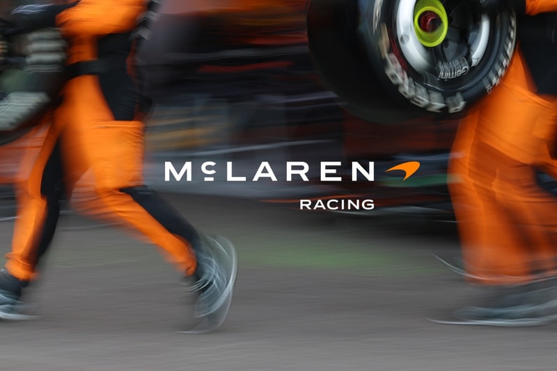
McLaren has unveiled a new corporate wordmark that is entirely in uppercase, drawing inspiration from a historic family garage sign located in Auckland, New Zealand. This visual identity update aims to reconnect the brand with its garage-built origins and will define the aesthetic for future production vehicles, merchandise, and digital platforms. The original garage, run by the parents of company founder Bruce McLaren, holds significant historical importance as the site where a young Bruce modified a 1929 Austin Seven, leading to his first motorsport victory at Muriwai Beach. By reviving the typography from this foundational workshop, McLaren anchors its contemporary hypercar lineup to the hands-on legacy of its namesake.
The redesigned branding replaces the previous mixed-case badge with an assertive, all-uppercase layout. This new wordmark utilizes a custom font specifically developed for the brand, named McLaren Sans. A distinctive horizontal line positioned directly beneath the letter 'C' in the wordmark serves as a direct homage to the original signage from the Auckland workshop. Despite these significant typographic alterations, McLaren has chosen to retain its most recognizable visual assets. The iconic Speedmark logo will continue to be used alongside the new text, and the Speedy Kiwi graphic has also been preserved to honor the company's New Zealand heritage.
In conjunction with the updated lettering, McLaren has introduced a nostalgic corporate color palette. This palette includes specific hues such as Papaya (an orange), Ember (a reddish-orange), Midnight (a blue), Black, Anthracite, Colnbrook (a silver), and Mist (a white). The automaker states that every color within this updated spectrum was meticulously sourced from a single vintage photograph. This deliberate choice in color selection further reinforces the brand's commitment to its historical roots and the era that shaped its beginnings. The rebranding initiative also coincides with the rollout of deeper personalization options for customers, suggesting a broader strategy to enhance customer engagement and brand loyalty by emphasizing heritage and individual expression.
The strategic shift in McLaren's visual identity signifies a deliberate move away from its more modern, streamlined corporate image towards an aesthetic that is deeply rooted in its foundational history. This heritage-inspired rebrand is not merely a cosmetic change but a comprehensive effort to reinforce the brand's narrative of innovation, passion, and a relentless pursuit of performance, all stemming from humble beginnings in a New Zealand garage. The integration of the new wordmark across all facets of the company's presence is expected to create a cohesive and powerful brand message that resonates with both long-time enthusiasts and new customers alike, emphasizing the enduring spirit of Bruce McLaren's original vision.
Original source — read the full reporting at the publisher:
Read on HypebeastGet the weekly AI digest
AI news + new model releases, weekly. Drafted by our agents, reviewed by humans.