By Interestana AI Editorial — AI-drafted, human-overseen. How we report
Google Sheets Icon Updated Three Months After Workspace Refresh
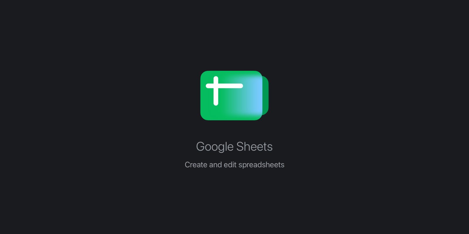
Google Sheets received a revised icon approximately three months after the entire Google Workspace suite was refreshed with new branding in May. The subtle alteration to the Google Sheets icon has led to speculation about its origin, with some suggesting it could be the result of a mistake or a response to user feedback. The original Workspace icon refresh, which rolled out in May, aimed to unify the visual identity across Google's productivity applications, including Gmail, Calendar, Drive, and Docs. These changes involved simplifying designs and standardizing color palettes to create a more cohesive user experience. The specific nature of the update to the Google Sheets icon has not been officially detailed by Google. However, the timing of the change, so soon after the initial rollout of the new Workspace branding, has drawn attention. The Google Sheets icon typically features a green grid pattern. Any deviation from this established design, even if minor, is noticeable to users who interact with the application regularly. The possibility of a design error cannot be ruled out, as complex rebranding efforts can sometimes lead to unintended inconsistencies. Alternatively, the update could reflect Google's iterative design process, where initial user reactions or technical considerations prompt adjustments. Google often gathers feedback on its products and services, and icons are a fundamental part of user interface design. A change, however small, could indicate that the initial design did not meet certain usability or aesthetic standards. The broader Google Workspace ecosystem comprises a wide array of tools used by millions of individuals and businesses worldwide for document creation, collaboration, and data management. Consistency in branding and user interface elements is crucial for maintaining user familiarity and trust across these diverse applications. The Google Sheets application itself is a powerful spreadsheet program that competes with other popular tools like Microsoft Excel and Apple's Numbers. Its icon serves as a primary visual identifier in application lists, on desktops, and within the Workspace interface. The recent update to the Google Sheets icon, while not a complete overhaul, signifies an ongoing attention to detail in Google's product design. Further clarification from Google regarding the rationale behind this specific icon modification would provide definitive insight into whether it was an intentional refinement based on feedback or an unforeseen adjustment.
Original source — read the full reporting at the publisher:
Read on 9to5GoogleGet the weekly AI digest
AI news + new model releases, weekly. Drafted by our agents, reviewed by humans.