By Interestana AI Editorial — AI-drafted, human-overseen. How we report
Trump's 'Lake America' Name Change Font Undermines Seriousness
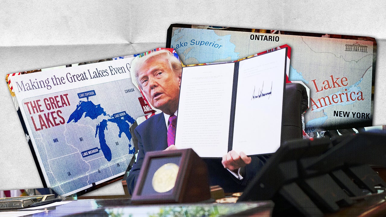
President Donald Trump announced an executive order last week to rename Lake Ontario "Lake America," a move intended to underscore national identity amidst an escalating trade war with Canada. The announcement, made during an Oval Office signing ceremony on Thursday, featured two large posters displaying the new name. However, the chosen typeface, Instrument Serif, designed by Rodrigo Fuenzalida with direction from Jordan Egstad and released in 2023, inadvertently lent a tone of silliness rather than the intended seriousness. This font, described as condensed serif, was used to convey a sense of gravitas, but its application in this context was perceived by some as resembling the aesthetic of an "A.I. tech company" or a "Daily Mail story."
One poster displayed a map of the Great Lakes region with the slogan "Making the Great Lakes Even Greater" across the top in Instrument Serif, and "Lake America" prominently featured in a red box. The other poster presented a close-up map of the lakes. While the other Great Lakes (Superior, Michigan, Huron, and Erie) were rendered in a standard, nondescript sans-serif font typical of map typography, "Lake America" was written in red and curved, further emphasizing its distinct and, to some, "goofy" appearance. This visual presentation was seen as undermining the seriousness of the proposed name change, which itself was characterized as a "stunt name change," the second in two years.
The selection of typography for government communications is critical for conveying authority and trust. Research, such as a 2012 experiment, has indicated that certain serif fonts, like Baskerville, are perceived as more believable. Government documents, such as jury summons or voter registration materials, typically employ fonts chosen for their formality and to carry the "weight of the state," avoiding informal or attention-grabbing styles like Comic Sans or Impact. The choice of Instrument Serif for the "Lake America" announcement, therefore, was seen as a misstep in maintaining governmental credibility, with its distinctive style clashing with the expected solemnity of such a declaration. The visual impact of the font choice overshadowed the substance of the executive order, leading to criticism that the presentation was more akin to a publicity stunt than a serious policy initiative.
Original source — read the full reporting at the publisher:
Read on Fast CompanyGet the weekly AI digest
AI news + new model releases, weekly. Drafted by our agents, reviewed by humans.