SNL UK Logo Design Employs British Street Sign Letters
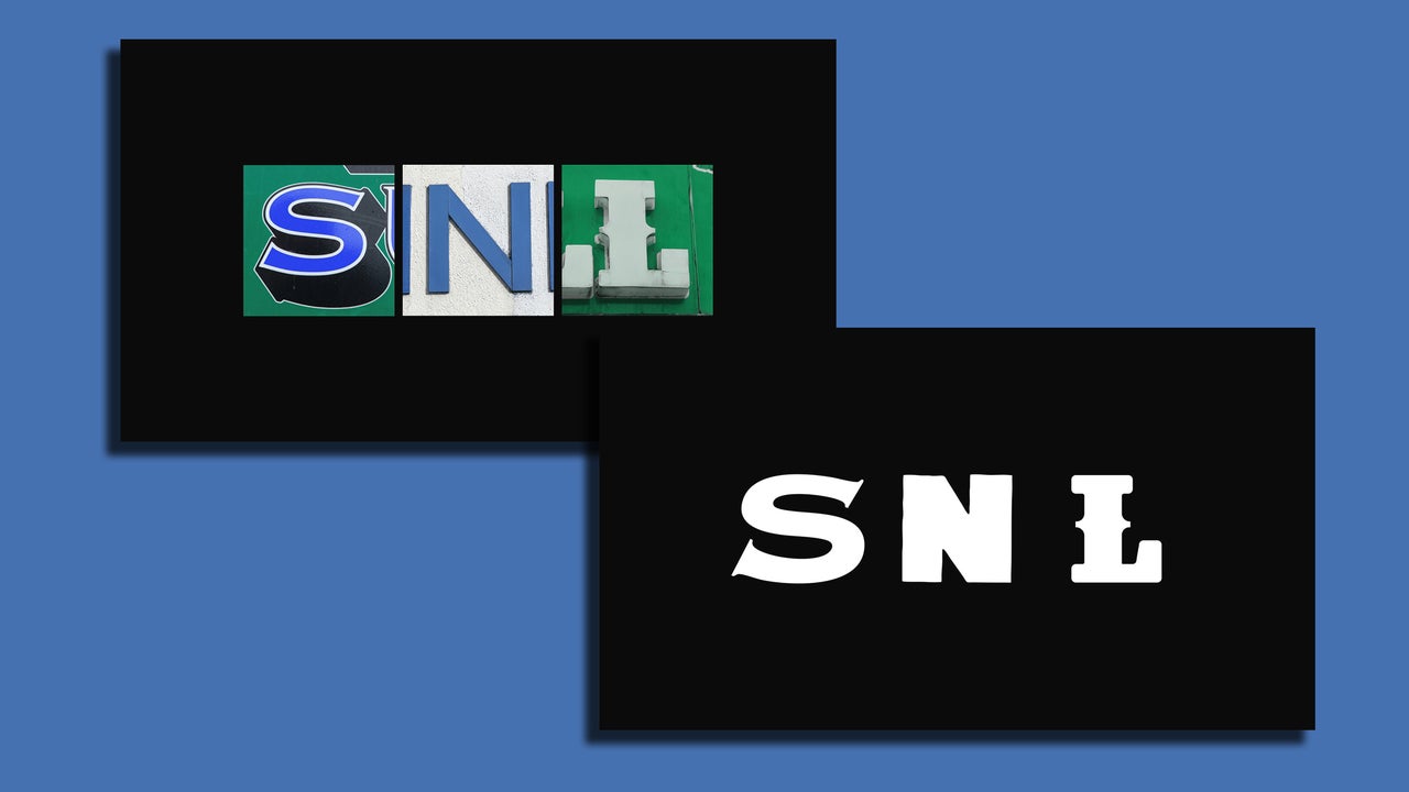
The logo for Saturday Night Live UK was developed by the creative agency Stink Studios, aiming to capture a distinctly British aesthetic. The design process involved collecting hundreds of photographs of the letters S, N, and L from various British signs found in London and other locations. These letters were sourced from diverse public places including bus stops, sandwich shops, and pubs.
Members of the Stink Studios team meticulously photographed these letters, which were then vectorized to create a sharp, scalable image format suitable for variable branding. Rick Dodds, executive creative director at Stink Studios, described the effort as a "labor of love," emphasizing the extensive work involved in finding, photographing, and vectorizing the letters to determine the most effective combinations. Some of the photographed letters are over 100 years old, reflecting the long-standing nature of British street architecture and signage.
The selected found letters were integrated with Serial B Neue, a rounded sans-serif typeface, to establish a consistent yet adaptable visual brand and typography. This approach allows for a unique logo for each episode of SNL UK, with no repetition. Senior designer Emma Judd, who led the project, explained that the "UK" designation is presented in superscript, with the other letters positioned dynamically on the baseline. This treatment suggests the "UK" acts as a stamp of approval or a sign-off for each broadcast.
Original source — read the full reporting at the publisher:
Read on Fast Company