By Interestana AI Editorial — AI-drafted, human-overseen. How we report
Norway's World Cup Jersey Font Draws Inspiration From Nordic Runes
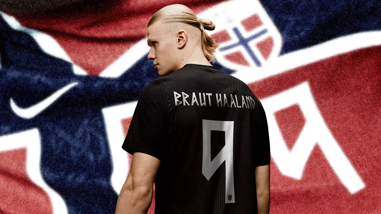
Norway's national soccer team is utilizing a new jersey font for the 2026 World Cup, named Taakeferd, which translates to "journey through the fog." This typeface is inspired by the runic alphabet, an ancient Scandinavian writing system historically used by Vikings. The design aims to connect with the country's heritage and signifies Norway's return to the World Cup after a 28-year absence, their first appearance since 1998.
Initial attempts to incorporate a runic-inspired font for Norway's 2024 kits proved problematic. The characters were described as jagged, sharp, and difficult to discern, particularly on the home kits. This lack of legibility also violated FIFA's regulations, which mandate that typography on World Cup kits must be "clearly legible and distinguishable from a distance" for all participants and observers. The previous design failed to meet these strict requirements.
Nike, the kit manufacturer, collaborated with the Norwegian Football Federation to develop Taakeferd. The new typeface is characterized by its composition of vertical or diagonal lines, creating distinctive triangular shapes within curved Latin letterforms, such as in the letters 'B' and 'R'. The design process involved extensive research into the runic alphabet's angular strokes and sharp geometry. This partnership ensured that the kits would possess an "unmistakably Norwegian" aesthetic.
FIFA regulations also dictate specific parameters for the sizing and placement of player names and numbers on uniforms. While these elements must be in Latin characters, they can incorporate diacritical marks like accents and umlauts. The success of the Taakeferd font is underscored by Norway's progression to the quarterfinals of the 2026 World Cup, where they are scheduled to play England. The home kit draws inspiration from the Norwegian flag with its red, white, and blue Scandinavian cross, while the away kit is entirely black. The inclusion of the Viking-style font for names, numbers, and the "Norge" inscription on the inside back collar further enhances the national identity of the uniforms.
Original source — read the full reporting at the publisher:
Read on Fast CompanyGet the weekly AI digest
AI news + new model releases, weekly. Drafted by our agents, reviewed by humans.