By Interestana AI Editorial — AI-drafted, human-overseen. How we report
Pantone Adds 224 New Colors Reflecting Maximalist Design Trends
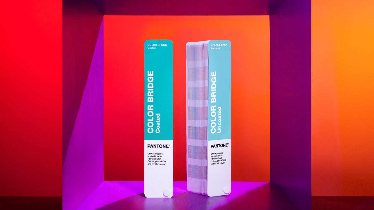
Pantone announced the addition of 224 new colors to its Matching System on Wednesday, marking the first expansion since 2022. These new shades represent a significant shift in design trends, moving away from minimalism towards a "more-is-more" aesthetic characterized by bolder hues and unusual color combinations. The company states that these additions reflect a growing preference for richer saturation and higher contrast in design. The new colors are available for purchase, with the color bridge guide set priced at $482 and the spot color chip set at $90. Following this expansion, Pantone now offers nearly 9,000 distinct colors in its comprehensive color-matching tool, utilized by designers, printers, and manufacturers globally.
The inspiration for this latest color palette expansion reportedly stems from trends identified by the Pantone Color Institute's global team of "color anthropologists." This strategic move by Pantone underscores a departure from the muted tones and neutral palettes that have dominated design in recent years. The institute highlights that Generation Z is a primary driver of this maximalist aesthetic, as this demographic interacts with and responds to color differently than previous generations, such as millennials, who were more accustomed to beiges and subtle shades. The introduction of these new color packs signifies that expressive, saturated, and bright color systems are becoming the new standard, supplanting the neutral colors of the past.
Pantone's decision to expand its color offerings also addresses the evolving needs of digital platforms, where standing out online is increasingly crucial. Laurie Pressman, Vice President of the Pantone Color Institute, explained to Fast Company that the influence of Gen Z, who are shaping internet culture, is a defining factor in this trend. She noted that Gen Z is moving away from neutral palettes in favor of more impactful shades that help them differentiate themselves in a "sea of sameness." This contrasts with the dominance previously held by black and muted tones, which were associated with "quiet luxury," restraint, and commercial safety. According to Pressman, these conventional choices are now losing ground to unconventional color pairings and more pronounced contrasts, indicating a broader industry-wide embrace of expressive and bold color strategies.
Original source — read the full reporting at the publisher:
Read on Fast CompanyGet the weekly AI digest
AI news + new model releases, weekly. Drafted by our agents, reviewed by humans.