By Interestana AI Editorial — AI-drafted, human-overseen. How we report
Jif Rebrands for First Time in 30 Years
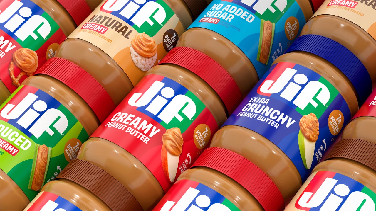
Jif, the well-known peanut butter brand, has undergone its first significant rebrand in 30 years, introducing a modernized visual identity that includes a new wordmark, logo, fonts, and photography. This refreshed branding is set to appear across all Jif products starting this fall. The rebrand is accompanied by a new campaign titled "Every Jif'ing Thing," launched on August 10, which aims to showcase the versatility of Jif beyond its traditional association with peanut butter and jelly sandwiches. The campaign highlights various usage occasions for the spread, such as in smoothies, yogurt bowls, and peanut noodles, signaling a broader repositioning effort by the brand.
According to Jif's internal research, approximately 85% of consumers could recognize the Jif logo by its distinctive red, blue, and green stripes. However, these consumers primarily associated the brand with the classic peanut butter and jelly sandwich. This limited perception is something Jif aims to expand as it introduces new product innovations, including squeezable tubes and a peanut butter and chocolate spread. The new visual identity is intended to communicate that Jif is not only a staple for children's lunches but also a "natural complement to an apple slice, rice cake, cracker, or even simply enjoyed from a spoon," as stated in a press release. This strategic shift is designed to broaden the brand's appeal and highlight its adaptability to various dietary preferences and consumption habits.
The rebrand comes at a time when companies are increasingly focused on updating their branding to remain relevant and modern. In 2023, Fast Company declared it the era of the "big rebrand," a trend that has evolved into the "refresh" in 2024, characterized by a lighter, less all-encompassing touch. Many companies are quicker to update their branding to appear modern, sometimes at the risk of sacrificing established brand equity. Examples of brands that have made significant changes to their logos include Eddie Bauer, Saint Laurent, and Johnson & Johnson, where modernization or legibility sometimes overshadowed existing brand recognition. Jif's approach, however, is noted for its subtle evolution. The brand has maintained its distinctive, "funky" lettering in its wordmark, allowing it to appear more modern without compromising its recognizability. This deliberate choice aims to leverage existing brand equity while signaling a forward-looking perspective and an expanded product vision.
Original source — read the full reporting at the publisher:
Read on Fast CompanyGet the weekly AI digest
AI news + new model releases, weekly. Drafted by our agents, reviewed by humans.