By Interestana AI Editorial — AI-drafted, human-overseen. How we report
Instagram Updates Text Logo With Hybrid Font Design
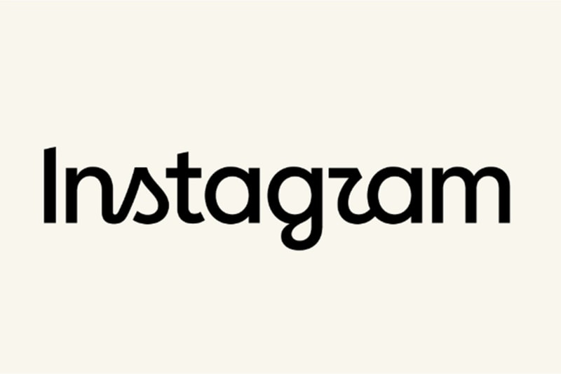
Instagram has officially retired its signature cursive wordmark, which had been its visual identity for over a decade, in favor of a new hybrid typographic design. This marks the app's first significant text-logo update since 2016. The refreshed logo combines elements of cursive flow with structured print lettering, featuring bolder strokes and stylized characters, particularly affecting the letters 's,' 'r,' and 'g.' While the multicolored gradient camera icon remains unchanged, the text at the top of the app's interface has been modernized. This redesign is part of a broader brand identity evolution within Meta's digital ecosystem. Instagram's design team explored numerous typographic directions, from rigid all-caps styles to literal handwriting samples, before settling on the final design. Jasmine Probst, Instagram's director of product design, stated that the chosen script aims to convey individuality while incorporating bolder, simpler elements with unexpected details. To support this visual overhaul, Instagram is introducing three custom typeface families: Instagram Sans, Instagram Pen, and Instagram Mono. The brand's signature gradient will also be applied more subtly across the user interface as the complete design system is rolled out globally through 2026. The initial public reaction to the logo update has been mixed, with many users expressing criticism. A significant point of contention involves the stylized rendering of certain letters, such as the 'g,' which some users have humorously likened to the word 'Instagzam.' This has led to a notable online discussion and commentary regarding the new design's aesthetic. Adam Mosseri, Head of Instagram, acknowledged the user feedback and the ongoing conversation surrounding the logo change. The company's intention with the redesign was to create a more versatile and modern visual language that could adapt across various platforms and applications. The introduction of distinct typeface families—Instagram Sans for general use, Instagram Pen for more expressive text, and Instagram Mono for coding or tabular data—aims to provide greater typographic flexibility. The transition to the new design system is expected to be a gradual process, with full implementation anticipated by 2026. This strategic update underscores Instagram's commitment to evolving its brand presence in line with contemporary design trends and user expectations, even as it navigates public opinion on its aesthetic choices.
Original source — read the full reporting at the publisher:
Read on HypebeastGet the weekly AI digest
AI news + new model releases, weekly. Drafted by our agents, reviewed by humans.