By Interestana AI Editorial — AI-drafted, human-overseen. How we report
Instagram Updates Wordmark for First Time in 10 Years
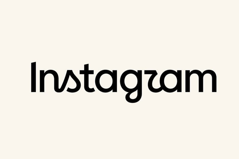
Instagram has unveiled a refreshed wordmark, marking the first update to the signature text logo at the top of its app in a decade. This subtle redesign, announced by Head of Instagram Adam Mosseri, retains the platform's familiar script style but introduces redrawn letterforms for a cleaner and more modern overall shape. The previous iteration of the wordmark was introduced in 2016, coinciding with a significant visual overhaul of the platform that famously replaced its original camera icon. Mosseri stated that the update was necessary as the wordmark had not changed in 10 years, and the goal was to create a cleaner, more modern design that still referenced the original while emphasizing simplicity and craft. The new typography aims to balance brand heritage with contemporary aesthetics, ensuring the visual identity evolves alongside the platform. This refresh is part of Instagram's ongoing efforts to maintain a relevant and appealing visual presence in the competitive social media landscape. The company's commitment to visual identity is evident in its consistent, albeit sometimes subtle, updates to its branding elements. The decision to update the wordmark after a full decade underscores the significance of this particular brand asset. The emphasis on "simplicity and craft" suggests a focus on refined design principles, aiming to enhance the user experience through a more polished visual presentation. The update is intended to feel both familiar to long-time users and appealing to new audiences, reflecting Instagram's continuous growth and adaptation. The social media giant, owned by Meta Platforms, Inc., has a history of evolving its visual identity to align with technological advancements and user engagement trends. This wordmark refresh is a testament to the enduring importance of foundational branding elements in a digital-first world. The specific details of the redrawn letterforms are not extensively detailed, but the description points to a meticulous refinement process aimed at achieving a superior aesthetic quality. The update signifies a commitment to maintaining a strong and recognizable brand identity, even as the platform introduces new features and services. The refresh is expected to be implemented across all Instagram interfaces where the wordmark appears, ensuring a consistent brand experience for its global user base. This move by Instagram highlights the strategic importance of visual branding in the digital age, where first impressions and brand recognition are paramount for user acquisition and retention. The company's approach to this update suggests a thoughtful consideration of its brand legacy while embracing forward-looking design principles. The refresh is a quiet but significant step in reinforcing Instagram's visual language and its position in the social media ecosystem.
Original source — read the full reporting at the publisher:
Read on HypebeastGet the weekly AI digest
AI news + new model releases, weekly. Drafted by our agents, reviewed by humans.