By Interestana AI Editorial — AI-drafted, human-overseen. How we report
Instagram Unveils New Wordmark After Decade-Long Stasis
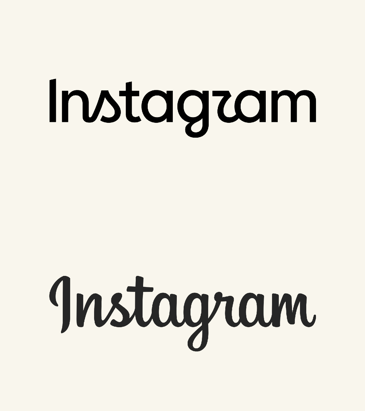
Instagram has unveiled a new wordmark, marking the social media application's first significant logo redesign in a decade. Adam Mosseri, head of Instagram, announced the change in an Instagram post, stating that the wordmark at the top of the app had not been updated in 10 years, necessitating a refresh. The new design aims to be cleaner and more modern, incorporating elements from the original logo while emphasizing simplicity and craft. This redesign moves away from Instagram's distinctive cursive font, though it retains subtle script-like features, such as connected "n" and "s" characters and playful swooshes on the "r" and "g".
The adoption of sans-serif lettering aligns Instagram's visual identity more closely with other Meta applications, including Facebook and Threads. Threads, a related platform, also received an updated visual identity in May of the current year. Fast Company reported at the time of the Threads redesign that the intention was to establish Threads as a distinct platform rather than solely an offshoot of Instagram. While further details regarding Instagram's redesign are expected, the announcement has already garnered significant attention on social media platforms. User reactions have been mixed, with some expressing dissatisfaction. One user on X described the new logo as "funky in the worst way possible," noting a perceived inconsistency between the retained script elements and the introduction of standard sans-serif "a" and "m" characters, as well as a difference in weight for the "I".
Many users have commented that the approach of partially retaining cursive elements while abandoning others creates a confusing readability, with some interpreting the new wordmark as "Instagzam." While some users have welcomed the modernization, with one commenting "Modernized we love it," others have expressed nostalgia for the previous design, with one user lamenting "the end of an era." The previous wordmark had been in place since 2016, and its iconic cursive style was a recognizable element of the brand's identity for many years. The shift to a sans-serif style represents a strategic move to unify the visual language across Meta's family of applications, aiming for a more cohesive brand experience for users interacting with platforms like Facebook, Instagram, and Threads.
Original source — read the full reporting at the publisher:
Read on Fast CompanyGet the weekly AI digest
AI news + new model releases, weekly. Drafted by our agents, reviewed by humans.