By Interestana AI Editorial — AI-drafted, human-overseen. How we report
Google Wallet Tests Vertical Card Stacking on Android
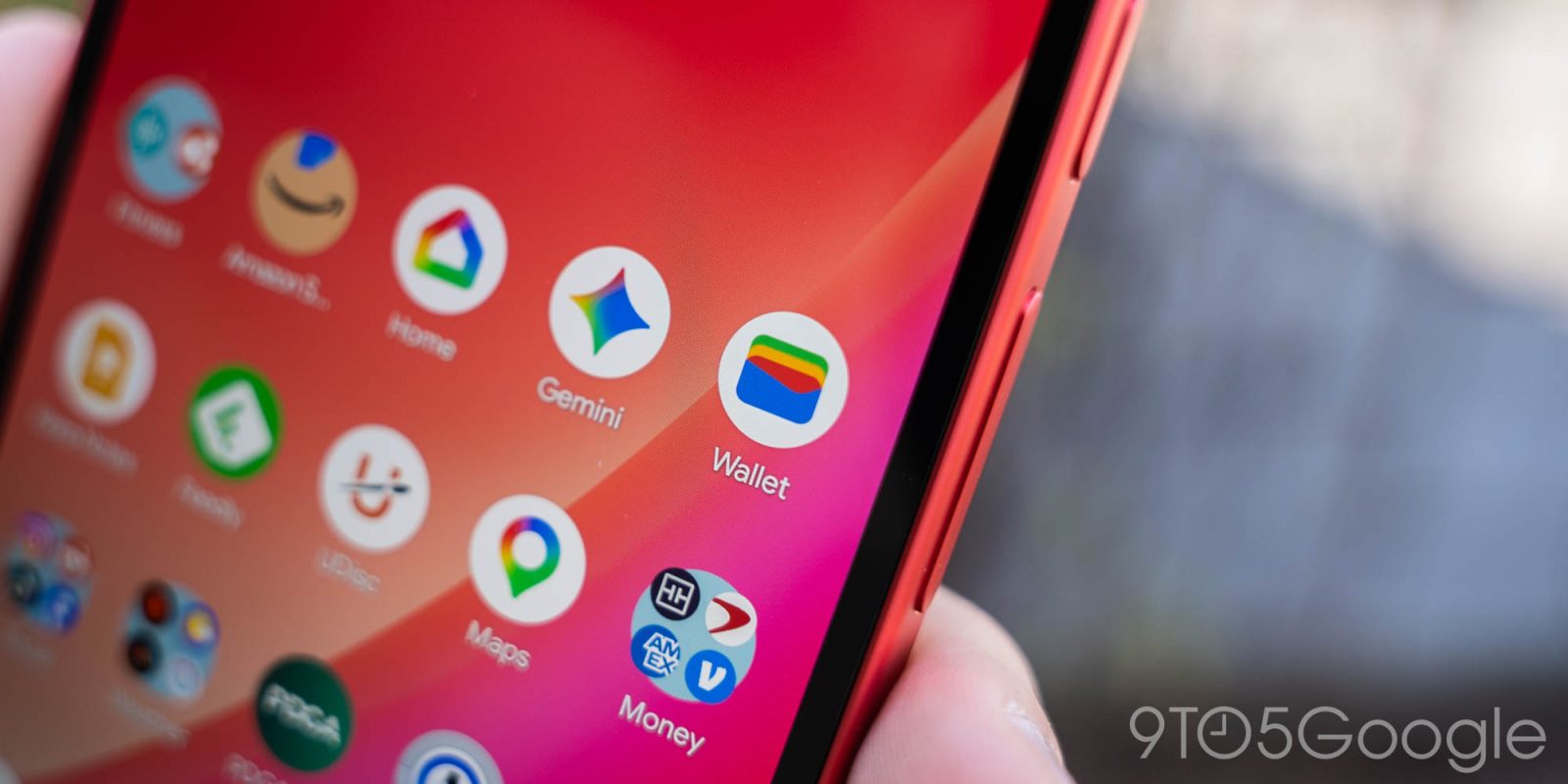
Google Wallet is currently testing a new user interface feature for its Android application that presents saved cards in a vertically stacked list. This change, observed in recent trials, represents a significant departure from the app's established horizontal card carousel design. The current interface displays cards side-by-side, requiring users to swipe horizontally to access different payment methods, loyalty cards, or transit passes. The proposed vertical stack would arrange these items one above the other, potentially allowing for more cards to be visible on screen simultaneously without extensive scrolling or swiping. This shift in presentation aims to streamline the user experience, making it quicker and more intuitive to locate and select a specific card. The move follows other recent interface updates to Google Wallet, including a redesign of its homepage and a revamp of its fullscreen pass views earlier in the year. These ongoing adjustments indicate Google's commitment to refining the digital wallet experience for its users. The vertical stacking feature is still in its trial phase, meaning it may not be rolled out to all users or could undergo further modifications before a wider release. The exact timeline for a potential public launch remains unconfirmed. This development is part of a broader trend in mobile application design to optimize screen real estate and improve navigation, particularly on devices with larger displays. By stacking cards vertically, Google Wallet could potentially offer a more information-dense view, allowing users to see more of their digital wallet contents at a glance. This could be particularly beneficial for users who store a large number of payment cards, loyalty programs, and other essential passes within the application. The success of this new layout will likely depend on user feedback and its effectiveness in improving the speed and ease of accessing stored information. The company has not yet provided specific details on the technical implementation or the user metrics it hopes to improve with this change. However, the trial suggests a focus on enhancing the core functionality of quickly retrieving and using digital credentials. The Android platform, with its diverse range of screen sizes and user interaction preferences, provides a fertile ground for such interface experiments. Google Wallet competes in a growing digital payments and personal information management market, where user experience is a key differentiator. Features that simplify access and management of digital assets are therefore crucial for maintaining user engagement and adoption. The company's iterative approach to updating its applications, as evidenced by the recent homepage and fullscreen pass revamps, suggests a data-driven strategy aimed at continuous improvement based on user behavior and feedback.
Original source — read the full reporting at the publisher:
Read on 9to5GoogleGet the weekly AI digest
AI news + new model releases, weekly. Drafted by our agents, reviewed by humans.