By Interestana AI Editorial — AI-drafted, human-overseen. How we report
Coca-Cola Unveils New Global Visual Identity
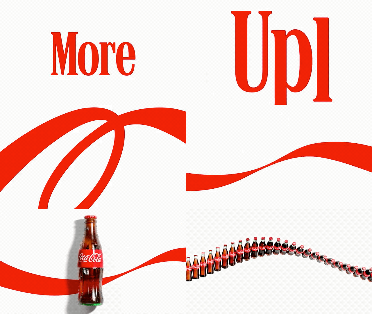
Coca-Cola unveiled a new global visual identity this week, marking a significant brand evolution for the 140-year-old company. The redesign, which has not yet launched in North America, maintains the brand's iconic red-and-white color palette and logo. However, the "Coca-Cola" wordmark on cans is now positioned vertically, and the lettering color is standardized across all varieties, a departure from previous designs where Coke Zero, for instance, used black lettering. The updated identity also emphasizes the brand's signature ribbon element, designed for both static and dynamic applications across various media platforms.
Arnab Roy, President of the Coca-Cola Global Category, stated in an announcement that the company has a responsibility to evolve while building on familiar elements. This approach aims to strengthen the foundation for growth while ensuring the brand remains "unmistakably Coca-Cola." The redesign incorporates assets suitable for the numerous platforms brands utilize today, balancing heritage with contemporary needs.
A notable aspect of the new visual identity is a tall serifed typeface from Brody Associates. This font has drawn comparisons from internet users to the wordmark of the iconic cigarette brand Marlboro. While not identical, the perceived similarity has sparked discussion on social media platforms like X, with users commenting on the resemblance and expressing concern that a beverage company's branding might evoke associations with cigarettes. This visual connection has been further amplified by the recent social media trend of referring to Coca-Cola as a "fridge cigarette."
Original source — read the full reporting at the publisher:
Read on Fast CompanyGet the weekly AI digest
AI news + new model releases, weekly. Drafted by our agents, reviewed by humans.